
This month's challenge is to "Show your Pride!" by painting up a standard bearer (or figures in blue, go here to see the explanation). I chose to go with this guy, with this flag for my Highborn Covenant army. It seemed the right thing to do.
Long tutorial and many pics after the cut.
 As you can see, this was not a project starting from scratch. I had already tried to put these two together, but unsuccessfully. I trimmed the flag from its old pole, and placed it on a copper rod. Harder than it looked due to the ribbon wrapping itself round the old pole. Then I drilled a hole to match the new copper pole in the hand. The drill bit was wider than the hand, hence the little piece of metal beside the standard bearer (his fingers). Guess this will be more of a modelling job than was first planned.
 The next step was to connect the pole to the mini. I used a little green stuff on the join between the lower and upper arm, and pinned that in place, as it needs to be a strong hold for such a heavy banner (there's a lot of lead in that flag, which will cause problems later). I then drilled a hole through the base, and the extra sprues I had previously glued beneath the base to help with the weight issues, to affix the flag. I glued the fingers back in place on the flag pole, and made a little thumb out of green stuff. The joins are not immaculate, so I may end up buying some liquid green stuff to fill the visible cracks, but the thumb actually looks not bad.


Next up, the painting. This mini has already been undercoated in gesso, due to the unforgiving Quebec winters, and then had a random base coat of black, brown and tan. The mini was actually bought second hand, and there may well have been another coat of paint under the gesso, I can't remember now. If I could take all that off, I would, but we're here now, so lets see what we can do with what we have.
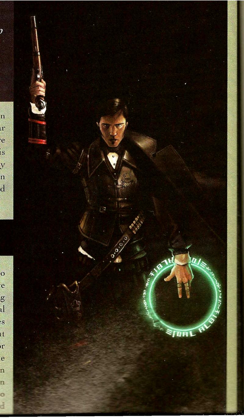 |
| Amethyst Gun Mage from NQ6 |

 To get the image I needed on the flag, I pulled out a pencil, and started sketching the freehand for the crown. The flag is quite forgiving of the unevenness of my drawing, as it is flapping around. I'm not sure I'll be doing the points of the flag black/dark, but the main body will be black, the crown silver/mithril and the ribbons purple. After that, I'll see of the flag pole works in gold/bronze, or if I'll need to go silver to work with the crown.


 A bit of P3 black ink, with some of the new GW Lahmian Medium (WFT is a Lahmia?) to tone down the shine, and here we are (along with other base colours added). I think the black ink over dark grey works well Highlighting with the grey again is much more natural than if i was painting grey over solid black. I tried to make the silver crown look as if it was stitched, but I feel I may have some work to do making that more realistic. Maybe even a silver pen, to produce even lines. The rest of the figure is now base coated and inked. On to the highlights. I think I may also have the answer to the base problem. A metal base may be necessary to weigh this guy down, as that is a heavy flag he's got there. Either that or it's off to Canadian Tire to buy some fishing weights
 Lastly,the highlighting is completed on the flag, and elsewhere. There is a lack of definition on his face that I may go back and touch up, and I'm not sure on the choice of tan for the breastplate, but I think I needed a lighter colour to break up the black.
 Notes:
Inspiration for colour scheme: here and here.
No comments:
Post a Comment